Chirasree Mandal
Software engineer, student teacher, and designer studying Computer Science at Berkeley.
she/her/hers
The Maggi Project
Maggi is a popular instant noodle brand in South Asian countries and the diaspora. As a 1.5th generation Bengali-American immigrant from India, the bright yellow instant noodle package was – and still is – a pantry staple. I place Maggi in same culinary-emotional cupboard as Kraft Mac and Cheese. Looking into its history, I was surprised by its origin story.
Maggi is a Swiss brand dating back to the 1800s, currently owned by Nestle. Maggi’s instant noodle package hit India in the 1980s, marketed to moms who were modern working women.
In its first ads, the brand popularized the image of the “Maggi Mom”: she cared for her children as much as the more-traditional Indian mother, but, as a modern working woman, didn’t have the time to make time-consuming curries. Kids loved Maggi; moms loved making Maggi. It took only “2 Minutes” (a phrase used in India to mean, “like, pretty soon,” i.e., anything from now to twenty minutes from now).
-- How Maggi noodles became India’s favourite comfort food,
The “2-minute noodles” were a hit and have remained popular in South Asia ever since (barring recent complications with food safety in India).
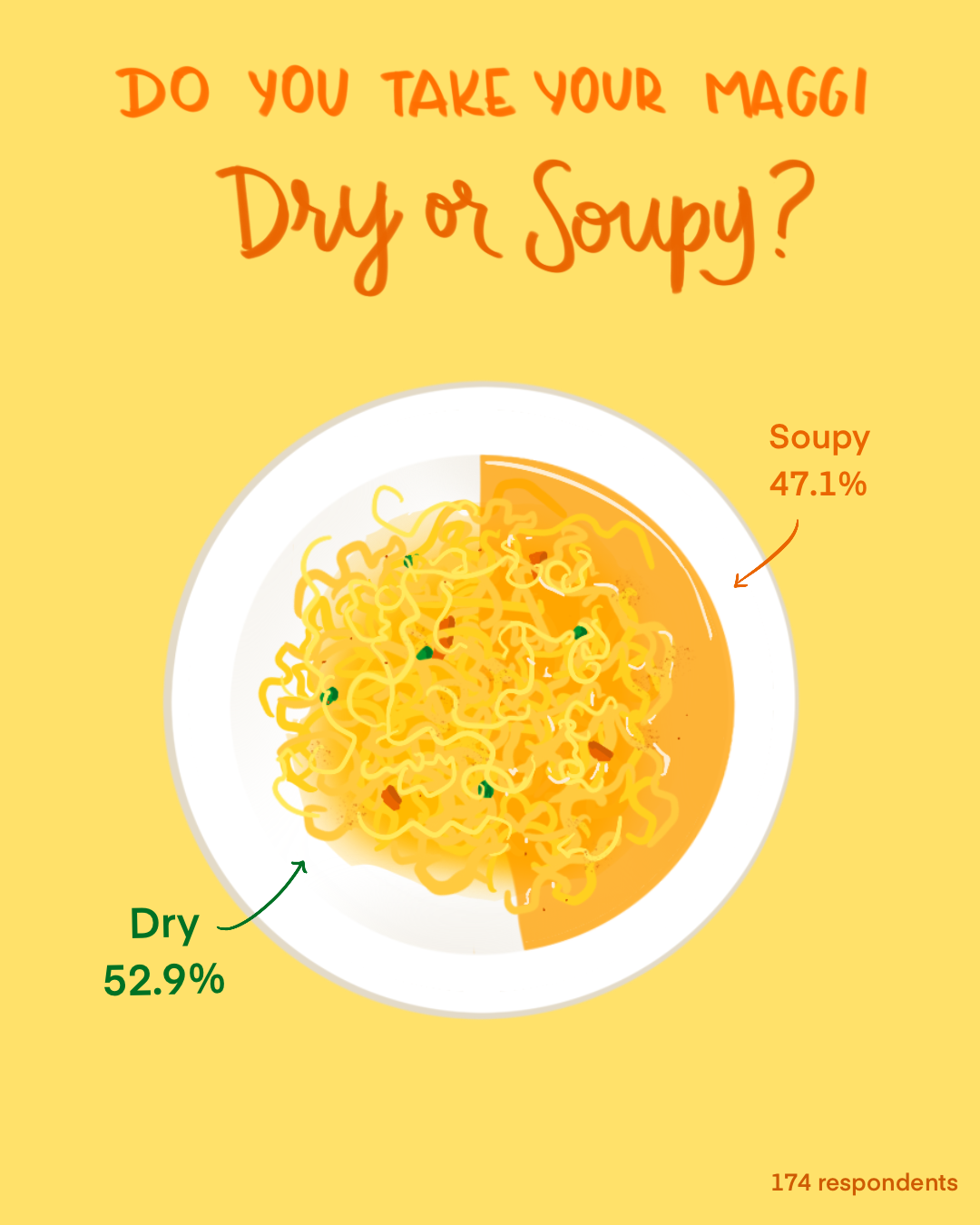
Though South Asia (and the diaspora) shares the same love for the instant noodles, Maggi’s preparation varies from city to city and family to family. Inspired by an instagram post, I sought to answer a seemingly simple question: Can you tell a lot about a person by if they like their Maggi dry or soupy?
I made a Google Forms survey asking mostly college students how they liked their Maggi, and a handful of other random questions such as:
- Where is your hometown?
- Where is your city of origin?
- Are you an immigrant?
The Process
I cleaned and analyzed the data with Python, using pandas. I used seaborn and matplotlib for early data visualizations and folium and opencages for geolocation and maps.
I sought to represent the data with playful and understandable visuals. I take inspiration from data journalist Mona Chalabi, who emphasizes showing uncertainty in data with hand-drawn elements. I drew the visuals on my iPad with Procreate.
Data Visuals
Suprisingly, people prefer their Maggi dry.
Things I learned
I started the project as a fun weeklong experiment, and was overwhelmed by the enthusiasm and the number of responses I recieved. People are very particular about their instant noodles, and it was fun to see friends argue on social media about #TeamDry and #TeamSoupy. Looking back, here are a few things I learned and would do differently if I could approach the project again.
Project design
Considering cultural memory
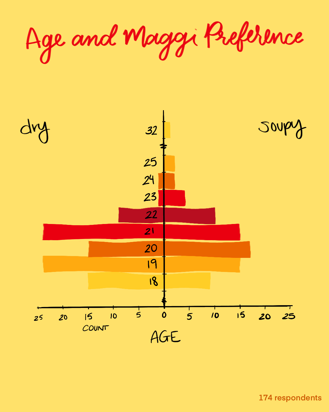
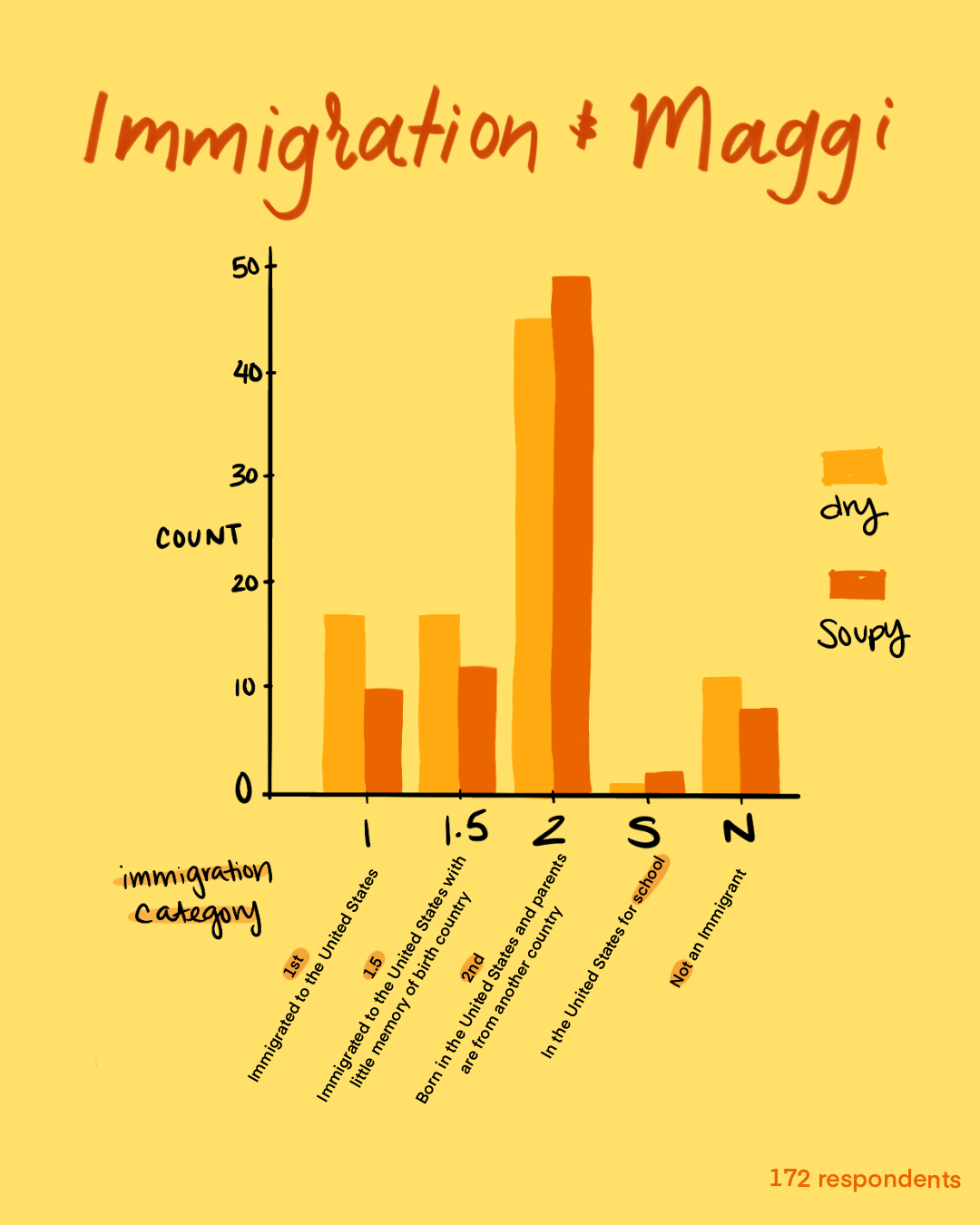
Looking back on what I learned about Maggi’s history, the noodles really became popular in India when my parents’ generation were growing up. By the 90’s, hundreds of thousands of people were migrating out of India, with the overwhelming majority going to the UK and USA (source). While I looked at immigration generation in my survey, most of the respondents were in their early 20’s. I’d really like to see how older South Asians feel about Maggi, and would love to include people in Europe as well.
Questionnaire design
Keep text data categorical and discrete whenever possible
When asking questions about immigration and geographic origin, I wanted to be as inclusive as possible and allow respondents to explain their personal histories with an open text box. However, my assumptions on the data input being mostly uniform challenged me when it was time for analysis.
Specifically, I asked about geographic origin in terms of “hometown” and “city of origin”. But people may have multiple cities of origin, (for example, their parents are from two different cities, and therefore they identify with two different regional cultures). While I tried to enforce input format with a suggestion of City, State, Country, this got complicated as India, and several other countries have changed with each generation of immigrants. Therefore I encountered differences between reported names of states and cities and their modern-day geopolitical names.
In the future, States might be changed to State/Province/Territory on a form to be more inclusive, and I’d like to separate the input of City, State, and Country. Perhaps including auto-population for locations might be useful, as well as the ability to add multiple origin locations. While the opencages api is easy to work with, leveraging autocomplete and location services at the form level would save a lot of time and labor in the data cleaning process.
*visuals about geographic origin are being refactored for web interaction
Sometimes, less data is better
A slightly amusing example of this is with color and area of study/major. I kept both as text instead of multiple-choice. I believe in hindsight that coarse-grain, categorical data would have been much easier to analyze with this sample size. For example, responses "cornflower blue" and "navy" would have functionally been "blue" on my end for analysis. Or I would have condensed "Computer Science" and "Applied Math" into a "STEM" category. In the end I decided not to analyze color because I couldn’t find an efficient way to map responses into coarse categories. In the future, these are questions I would make into multiple choice form questions.